Maps seek to represent the curved surface of the spherical earth on a flat surface. All methods we have of doing this introduce some distortion or another and involve trade-offs between distortions of shapes, relative distortion of areas at different latitudes, variations in distance between points on the map which are actually equidistant and so on. Despite these issues, it is clear that maps are a valuable resource in understanding geography and increasing awareness about the world. They are more compact and easier to carry than globes and are especially well suited for representation on flat computer screens as increasingly popular internet maps are. While there are infinitely many methods of map projection, of which a few are most popular, this post is about the considerations involved in choosing the relative orientations of maps- which part of the surface of the earth will they be centered on, which directions will form the horizontal and vertical parallels and which part of our wide world will be consigned to the far left and right, split partially between those two ends.
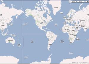
There seems to be a certain natural reasoning behind choosing the north and south poles as two opposite sides of a rectangular map. The earth spins on a north-south axis. So, it would seem logical to have the north-south axis either horizontal or vertical on the map. The north and south poles which are distorted the most by this projection are also the least populated areas in the world, which makes the map the most helpful for most people around the world. But, the question of which part of the world the map would center on doesn’t seem to follow from any easy utilitarian argument. The alignment I have most commonly encountered in the United States is shown below in Fig: 1. I have sourced all figures in this post from the ever helpful google maps. It has the United States right in the middle and cuts through Russia, China and countries in Southeast Asia.

Fig: 1 Americas in the center
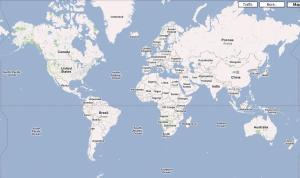
Understandably, this is not very popular outside the Americas. Even as an objective analyst, it doesn’t strike as particularly helpful. The two biggest oceans of the world are close to the center whereas some of the most populous regions are consigned to the far corners or ever cut into parts. Another version of the map, which is more popular in much of Eurasia is shown below in Fig: 2.

Fig: 2 Greenwich in the middle
This map has the zero degree longitude at the center and splits at the international date line. This has the advantage of splitting the map in the pacific ocean which is the least populated stretch of the planet and which has no large land masses that are cut into two by the map. Although this map is a product of the Eurocentrism of the 19th century and reflects the primacy of the British Empire in global affairs in how the center of the map passes through London, it has the advantage of having much of the populated areas of the world towards the center of the map. A natural argument can also be made in favour of this alignment. Pangaea, the supercontinent which split to form all the current continents of the world would be left uncut by this map scheme. Pangaea was surrounded by what are today the Pacific, Arctic and Southern oceans, which this map scheme shows towards the corners, surrounding the inhabited world.

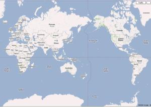
Fig: 3 The human story
Finally, Fig: 3 above shows another plausible map scheme which retains many of the advantages of Fig: 2, but adds a human element to the arguments. Here, the map is cut in the atlantic, which also avoids cutting through any large populated countries (except Greenland). Although the large pacific ocean is towards the center of the map, this alignment traces the migration of modern humans from Africa to populate the rest of the World. Humans crossed from Africa to the Middle East and onto Asia, Europe, Australia and across the Berring strait to the Americas. This map shows that entire route without break, which makes it an ideal candidate for a shared human map.
I do intend this only as a purely academic exercise. Maps are inherently political and are unlikely ever to be objectively drawn. Besides, with human progress I hope these issues fade away in importance rather than having to be renegotiated. Internet maps already are flexible enough to be centered at customisable places. But, that doesn’t take away from the fun of exploring what might be the pros and cons of different hypothetical possibilities!

Recent Comments